Design system for Foxway
Foxway had grown into a company running multiple platforms without ever having a unified design system. These had been built independently over time, leaving these platforms visually and functionally inconsistent. I built Foxway's first design system solo, establishing shared components and a consistent visual language across the company's tools.
Design system for Foxway
Foxway had grown into a company running multiple platforms without ever having a unified design system. These had been built independently over time, leaving these platforms visually and functionally inconsistent. I built Foxway's first design system solo, establishing shared components and a consistent visual language across the company's tools.
client
Foxway
agency
NOPE
my role
UX/UI designer
tools
Figma
project timeline
2024
Design system for Foxway
Foxway had grown into a company running multiple platforms without ever having a unified design system. These had been built independently over time, leaving these platforms visually and functionally inconsistent. I built Foxway's first design system solo, establishing shared components and a consistent visual language across the company's tools.
client
Foxway
agency
NOPE
my role
UX/UI designer
tools
Figma
project timeline
2024
Foundations
Foundation #1
Grid
Defined a responsive grid system across mobile, tablet, and desktop, with the desktop grid adapting to both expanded and collapsed side navigation states."


Foundation #2
Typography
Defined a full type scale across headers, body text, links, buttons, and labels, each sized for both desktop and mobile, to keep text consistent and legible across every product.


Foundation #3
Colors
Built a full color token system on top of Foxway's existing brand colors, generating a complete shade ramp for each and organizing them into semantic tokens for backgrounds, text, icons, and borders, each with default, hover, active, and disabled states, plus dedicated feedback colors for error, warning, success, and info messaging.
Atomic design


Atomic design #1
Stepper
Built from its core atoms, step indicators for upcoming, current, and completed states, and connector lines to show progress, then combined into the finished component.
Atomic design #2
Side navigation
Built from its core atoms, the universe switcher, menu items across three tiers, pinned shortcuts, and the expand-collapse control, each with their own interactive states, then combined into a component that adapts across desktop expanded, desktop collapsed, and mobile.
Atomic design #3
Table
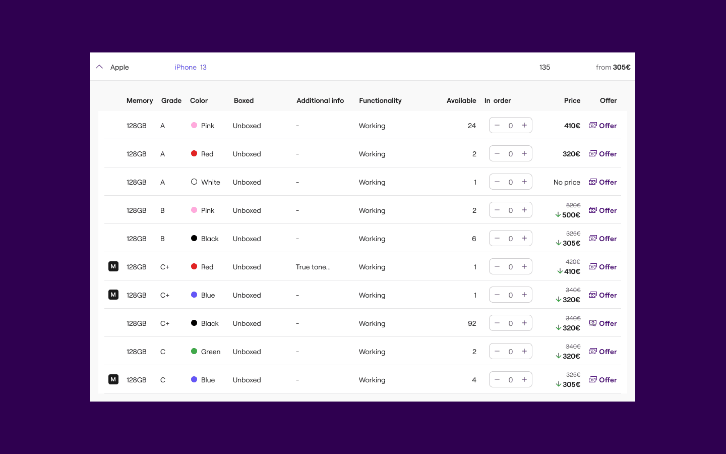
Built from its core atoms, header cells with their interactive states and row cell variants like quantity steppers, color swatches, and offer buttons, then combined into a component that stays consistent across the platform, handling real, data-heavy product listings rather than placeholder content.

Foundations
Foundation #1
Grid
Defined a responsive grid system across mobile, tablet, and desktop, with the desktop grid adapting to both expanded and collapsed side navigation states."
Foundation #2
Typography
Defined a full type scale across headers, body text, links, buttons, and labels, each sized for both desktop and mobile, to keep text consistent and legible across every product.
Foundation #3
Colors
Built a full color token system on top of Foxway's existing brand colors, generating a complete shade ramp for each and organizing them into semantic tokens for backgrounds, text, icons, and borders, each with default, hover, active, and disabled states, plus dedicated feedback colors for error, warning, success, and info messaging.
Atomic design
Atomic design #1
Stepper
Built from its core atoms, step indicators for upcoming, current, and completed states, and connector lines to show progress, then combined into the finished component.
Atomic design #2
Side navigation
Built from its core atoms, the universe switcher, menu items across three tiers, pinned shortcuts, and the expand-collapse control, each with their own interactive states, then combined into a component that adapts across desktop expanded, desktop collapsed, and mobile.
Atomic design #3
Table
Built from its core atoms, header cells with their interactive states and row cell variants like quantity steppers, color swatches, and offer buttons, then combined into a component that stays consistent across the platform, handling real, data-heavy product listings rather than placeholder content.
Reflection
I'm grateful for the opportunity to build a design system for a company with as many platforms and products as Foxway, and happy that I was trusted with it. This was my first design system (before this I'd only built style guides) so it was a real learning curve. Looking back, some components could have been built with more flexibility and the system still lacks proper documentation but it gave Foxway's product real consistency for the first time, and it's given me a foundation I can keep building on
Reflection
I'm grateful for the opportunity to build a design system for a company with as many platforms and products as Foxway, and happy that I was trusted with it. This was my first design system (before this I'd only built style guides) so it was a real learning curve. Looking back, some components could have been built with more flexibility and the system still lacks proper documentation but it gave Foxway's product real consistency for the first time, and it's given me a foundation I can keep building on
Reflection
I'm grateful for the opportunity to build a design system for a company with as many platforms and products as Foxway, and happy that I was trusted with it. This was my first design system (before this I'd only built style guides) so it was a real learning curve. Looking back, some components could have been built with more flexibility and the system still lacks proper documentation but it gave Foxway's product real consistency for the first time, and it's given me a foundation I can keep building on


