End-to-end B2B commerce for Foxway
Foxway’s B2B shop suffered from high user friction and functional gaps, forcing clients to abandon the digital store in favor of manual "workarounds." A steep learning curve and missing or deficient core features forced users to "step out" of the platform and rely on email, Excel sheets, and phone calls. This reliance on manual ordering turned high-value Account Managers into data-entry clerks, preventing the sales team from focusing on growth and scale.
client
Foxway
agency
NOPE
my role
UX/UI designer
researcher
tools
Figma
FigJam
project timeline
May 2024 - Jan 2025
End-to-end B2B commerce for Foxway
Foxway’s B2B shop suffered from high user friction and functional gaps, forcing clients to abandon the digital store in favor of manual "workarounds." A steep learning curve and missing or deficient core features forced users to "step out" of the platform and rely on email, Excel sheets, and phone calls. This reliance on manual ordering turned high-value Account Managers into data-entry clerks, preventing the sales team from focusing on growth and scale.
End-to-end B2B commerce for Foxway
Foxway’s B2B shop suffered from high user friction and functional gaps, forcing clients to abandon the digital store in favor of manual "workarounds." A steep learning curve and missing or deficient core features forced users to "step out" of the platform and rely on email, Excel sheets, and phone calls. This reliance on manual ordering turned high-value Account Managers into data-entry clerks, preventing the sales team from focusing on growth and scale.
client
Foxway
agency
NOPE
my role
UX/UI designer
researcher
tools
Figma
FigJam
project timeline
May 2024 - Jan 2025
Key outcomes & solutions
Key outcome #1
We enabled users to complete the full procurement lifecycle, from stock browsing to after-sales, without contacting an Account Manager or leaving the platform...
…by giving users the information they needed to buy with confidence
Previously, the catalogue showed only the bare minimum: grade, condition, colour, and occasionally a note. Users regularly called their AM to ask basic questions about a device, and orders arrived with unexpected surprises, driving up returns. Now, clicking any device row opens a side sheet with full product details. The most critical information is immediately visible; additional specs are available in an expandable accordion. It's a scalable pattern: new data fields can be added without cluttering the catalogue view.
…by bringing price negotiation into the platform
Negotiating prices previously meant stepping out of the shop entirely. A back-and-forth over email or phone that could take days. For eligible clients, there's now an offer flow built directly into the catalogue. Clicking the offer button opens the device side sheet with a focused price input, so the user can type their offer immediately. Once submitted, the offer status is visible both on the catalogue row and in the detail view. No more chasing the AM for updates. Foxway can accept or counter, and the user can respond, all without leaving the platform.
…by replacing a multi-tool returns process with a single flow
This was the most painful gap in the old shop. Returning devices meant contacting the AM, receiving a Zendesk link, downloading an Excel template, manually copying order data into it, attaching the file to a form, and waiting for an email reply — all outside the shop, all friction. Now users paste a bulk list of IMEIs directly into the platform. The system flags ineligible devices immediately. From there, users build an RMA draft ( defining issues, attaching images, adding notes) and submit. The active RMA view tracks progress at each stage, and final verdicts appear line by line, including replacement device details where applicable.
Key outcome #2
We reduced friction in the order flow so that repeat and bulk purchases feel fast…
…by replacing a flat list with a scannable catalogue structure
The old catalogue was ungrouped: identical product names repeated across dozens of rows, forcing users to manually scan the entire list to find a specific configuration. For anyone browsing rather than searching for an exact SKU, it was exhausting. The new catalogue organises devices by brand and model, with all variations (grade, colour, memory, condition) nested inside expandable rows. Users can now spot what's available at a glance, and expand only what interests them. Filtering and sorting were also improved, but the structure alone reduced the scanning burden significantly.
…by letting users build their own shortcuts
Interviews with both Account Managers and clients revealed that filtering options in the old shop were inadequate. But digging deeper, it became clear that users weren't a monolithic group. Some browsed catalogues opportunistically, others searched for specific configurations, and most ordered the same types of devices repeatedly, building up a personal portfolio of preferred products over time. Rather than just improving the filter, we designed three separate tools for three distinct user behaviours: filter templates for users who always narrow down by the same criteria; favourites for pinning specific devices they return to regularly; and pinnable menu items for quickly jumping to the catalogue sections they visit most. Together they mean that a repeat buyer's second session is significantly faster than their first.
…by making it easier to build and manage orders while browsing
In the old shop, the order selection lived in the top right corner, disappearing from view as soon as users scrolled down the catalogue. Working across multiple drafts was also impossible without a page refresh: if a user was adding devices to one draft and remembered they needed to add something to another, they had to reload the page and find their place again.The new shop introduces a persistent bottom action bar that stays visible throughout the entire browsing session. It shows the selected draft, a live order summary with quantity and total price, and a direct button to proceed to draft overview. Users can switch between drafts from the bar instantly ( no refresh, no lost context) and the catalogue responds in real time, highlighting the "In order" column to show which devices are already in the selected draft.If a user starts adding devices before selecting an order, the experience guides them progressively rather than blocking them: a tooltip draws attention to the order dropdown first, and if missed, the dropdown opens automatically. This guidance was added in response to usability testing. Without it, users consistently missed the dropdown entirely.
…by giving repeat buyers a jumpstart on their next order
Returning to the catalogue to rebuild an identical or similar order from scratch is unnecessary friction for a repeat buyer. Shipped orders now include an "Order again" button that creates a new draft pre-populated with the same devices — not an automatic resubmission, just a starting point. Users can add, remove, or swap items before proceeding, which also handles the common scenario where some devices from the original order are no longer in stock.
Key outcome #3
We designed the platform to be immediately usable — for first-time users and seasoned ones, tech-savvy or not...
…by replacing organic growth with intentional design
The old shop had grown organically over time, with features added wherever it was technically convenient rather than where they made sense for the user. The most telling example was the checkout: four buttons sat at the final step — Place an order, Pay with PayPal, Request reservation, Accept price — because functionality had been bolted onto the end of the flow rather than placed where it logically belonged. Price negotiation and device reservation were moved to earlier stages, leaving checkout with a single action: place the order.The redesign applied clear logic to the entire flow.
…by offering an optional onboarding walkthrough
Switching to a new procurement platform is a disruption, especially for users who have built workarounds around the old one. For users who prefer a guided introduction, an optional tutorial walks through the key features of the shop. It’s accessible both on first login and anytime from the sidebar. Nobody who doesn't need it has it forced on them.
Who were we designing for?


Who were we designing for?
Who were we designing for?
Key outcomes & solutions
Key outcome #1
We enabled users to complete the full procurement lifecycle, from stock browsing to after-sales, without contacting an Account Manager or leaving the platform...
…by giving users the information they needed to buy with confidence
Previously, the catalogue showed only the bare minimum — grade, condition, colour, and occasionally a note. Users regularly called their AM to ask basic questions about a device, and orders arrived with unexpected surprises, driving up returns. Now, clicking any device row opens a side sheet with full product details. The most critical information is immediately visible; additional specs are available in an expandable accordion. It's a scalable pattern — new data fields can be added without cluttering the catalogue view.
Previously, the catalogue showed only the bare minimum: grade, condition, colour, and occasionally a note. Users regularly called their AM to ask basic questions about a device, and orders arrived with unexpected surprises, driving up returns. Now, clicking any device row opens a side sheet with full product details. The most critical information is immediately visible; additional specs are available in an expandable accordion. It's a scalable pattern: new data fields can be added without cluttering the catalogue view.
…by bringing price negotiation into the platform
Negotiating prices previously meant stepping out of the shop entirely. A back-and-forth over email or phone that could take days. For eligible clients, there's now an offer flow built directly into the catalogue. Clicking the offer button opens the device side sheet with a focused price input, so the user can type their offer immediately. Once submitted, the offer status is visible both on the catalogue row and in the detail view. No more chasing the AM for updates. Foxway can accept or counter, and the user can respond, all without leaving the platform.
…by replacing a multi-tool returns process with a single flow
This was the most painful gap in the old shop. Returning devices meant contacting the AM, receiving a Zendesk link, downloading an Excel template, manually copying order data into it, attaching the file to a form, and waiting for an email reply — all outside the shop, all friction. Now users paste a bulk list of IMEIs directly into the platform. The system flags ineligible devices immediately. From there, users build an RMA draft ( defining issues, attaching images, adding notes) and submit. The active RMA view tracks progress at each stage, and final verdicts appear line by line, including replacement device details where applicable.
Key outcome #2
We reduced friction in the order flow so that repeat and bulk purchases feel fast…
…by replacing a flat list with a scannable catalogue structure
The old catalogue was ungrouped — identical product names repeated across dozens of rows, forcing users to manually scan the entire list to find a specific configuration. For anyone browsing rather than searching for an exact SKU, it was exhausting. The new catalogue organises devices by brand and model, with all variations — grade, colour, memory, condition — nested inside expandable rows. Users can now spot what's available at a glance, and expand only what interests them. Filtering and sorting were also improved, but the structure alone reduced the scanning burden significantly.
The old catalogue was ungrouped: identical product names repeated across dozens of rows, forcing users to manually scan the entire list to find a specific configuration. For anyone browsing rather than searching for an exact SKU, it was exhausting. The new catalogue organises devices by brand and model, with all variations (grade, colour, memory, condition) nested inside expandable rows. Users can now spot what's available at a glance, and expand only what interests them. Filtering and sorting were also improved, but the structure alone reduced the scanning burden significantly.
…by letting users build their own shortcuts
Interviews with both Account Managers and clients revealed that filtering options in the old shop were inadequate. But digging deeper, it became clear that users weren't a monolithic group. Some browsed catalogues opportunistically, others searched for specific configurations, and most ordered the same types of devices repeatedly, building up a personal portfolio of preferred products over time. Rather than just improving the filter, we designed three separate tools for three distinct user behaviours: filter templates for users who always narrow down by the same criteria; favourites for pinning specific devices they return to regularly; and pinnable menu items for quickly jumping to the catalogue sections they visit most. Together they mean that a repeat buyer's second session is significantly faster than their first.
…by making it easier to build and manage orders while browsing
In the old shop, the order selection lived in the top right corner, disappearing from view as soon as users scrolled down the catalogue. Working across multiple drafts was also impossible without a page refresh: if a user was adding devices to one draft and remembered they needed to add something to another, they had to reload the page and find their place again.The new shop introduces a persistent bottom action bar that stays visible throughout the entire browsing session. It shows the selected draft, a live order summary with quantity and total price, and a direct button to proceed to draft overview. Users can switch between drafts from the bar instantly ( no refresh, no lost context) and the catalogue responds in real time, highlighting the "In order" column to show which devices are already in the selected draft.If a user starts adding devices before selecting an order, the experience guides them progressively rather than blocking them: a tooltip draws attention to the order dropdown first, and if missed, the dropdown opens automatically. This guidance was added in response to usability testing. Without it, users consistently missed the dropdown entirely.
…by giving repeat buyers a jumpstart on their next order
Returning to the catalogue to rebuild an identical or similar order from scratch is unnecessary friction for a repeat buyer. Shipped orders now include an "Order again" button that creates a new draft pre-populated with the same devices — not an automatic resubmission, just a starting point. Users can add, remove, or swap items before proceeding, which also handles the common scenario where some devices from the original order are no longer in stock.
Key outcome #3
We designed the platform to be immediately usable — for first-time users and seasoned ones, tech-savvy or not...
…by replacing organic growth with intentional design
The old shop had grown organically over time, with features added wherever it was technically convenient rather than where they made sense for the user. The most telling example was the checkout: four buttons sat at the final step — Place an order, Pay with PayPal, Request reservation, Accept price — because functionality had been bolted onto the end of the flow rather than placed where it logically belonged. Price negotiation and device reservation were moved to earlier stages, leaving checkout with a single action: place the order.The redesign applied clear logic to the entire flow.
…by offering an optional onboarding walkthrough
Switching to a new procurement platform is a disruption, especially for users who have built workarounds around the old one. For users who prefer a guided introduction, an optional tutorial walks through the key features of the shop. It’s accessible both on first login and anytime from the sidebar. Nobody who doesn't need it has it forced on them.
How did we get there?

How did we get there?
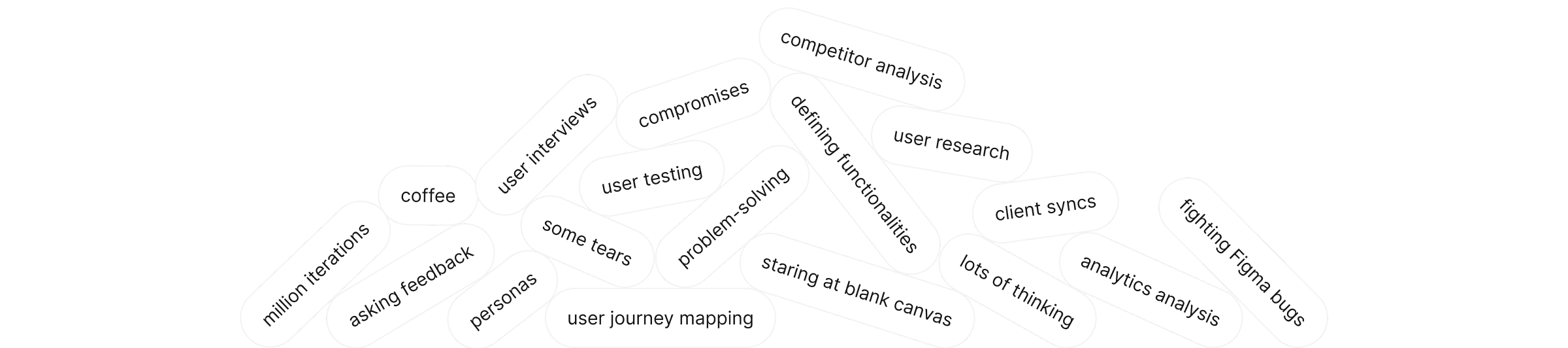
How did we get there?

Reflection
Looking back, what I'm most proud of isn't any single solution — it's that the design holds up. A year and a half after finishing, I can look at any screen and trace the reasoning behind every decision. Nothing was arbitrary. For a project of this complexity, tackled with only around eighteen months of UX/UI experience at the time, that means something to me.The client relationship was also something I didn't take for granted. They were genuinely invested — pushing back when needed, thinking alongside me, and trusting solutions that didn't have obvious precedents. The bottom action bar and order draft dropdown, for instance, weren't patterns I could borrow from somewhere else. I had to work them out from first principles. That was the hardest part of the project, and also the most rewarding.If I were starting over, I'd work differently rather than harder. Variables from the start, desktop and mobile designed in parallel rather than mobile as an afterthought, components better organised for responsive behaviour, and the Figma file split earlier before it became unmanageable.The biggest thing this project taught me — or confirmed — is that I work best when the problem is genuinely hard and the stakes are real. I wouldn't have assigned this project to myself at the time. I'm glad someone did.
Reflection
Looking back, what I'm most proud of isn't any single solution — it's that the design holds up. A year and a half after finishing, I can look at any screen and trace the reasoning behind every decision. Nothing was arbitrary. For a project of this complexity, tackled with only around eighteen months of UX/UI experience at the time, that means something to me.The client relationship was also something I didn't take for granted. They were genuinely invested — pushing back when needed, thinking alongside me, and trusting solutions that didn't have obvious precedents. The bottom action bar and order draft dropdown, for instance, weren't patterns I could borrow from somewhere else. I had to work them out from first principles. That was the hardest part of the project, and also the most rewarding.If I were starting over, I'd work differently rather than harder. Variables from the start, desktop and mobile designed in parallel rather than mobile as an afterthought, components better organised for responsive behaviour, and the Figma file split earlier before it became unmanageable.The biggest thing this project taught me — or confirmed — is that I work best when the problem is genuinely hard and the stakes are real. I wouldn't have assigned this project to myself at the time. I'm glad someone did.
Reflection
Looking back, what I'm most proud of isn't any single solution — it's that the design holds up. A year and a half after finishing, I can look at any screen and trace the reasoning behind every decision. Nothing was arbitrary. For a project of this complexity, tackled with only around eighteen months of UX/UI experience at the time, that means something to me.The client relationship was also something I didn't take for granted. They were genuinely invested — pushing back when needed, thinking alongside me, and trusting solutions that didn't have obvious precedents. The bottom action bar and order draft dropdown, for instance, weren't patterns I could borrow from somewhere else. I had to work them out from first principles. That was the hardest part of the project, and also the most rewarding.If I were starting over, I'd work differently rather than harder. Variables from the start, desktop and mobile designed in parallel rather than mobile as an afterthought, components better organised for responsive behaviour, and the Figma file split earlier before it became unmanageable.The biggest thing this project taught me — or confirmed — is that I work best when the problem is genuinely hard and the stakes are real. I wouldn't have assigned this project to myself at the time. I'm glad someone did.


