
Highlights
Landing page
Material browser
Rather than scrolling through one long list, materials are grouped into horizontal panels customers can leaf through, almost like flipping through pages of a book.

Landing page
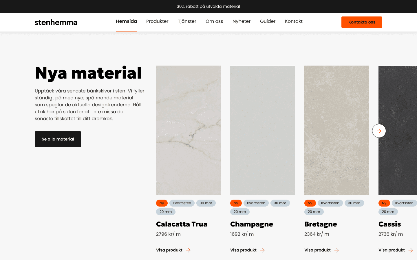
New materials
Material cards have a tall, narrow shape closer to an actual stone slab than a typical product thumbnail, so browsing feels closer to looking at real material samples.
Reusable section
Brand-shaped cards
The news card images echo the shape of Stenhemma's logo mark, a nice detail from the brand identity that I carried through into this common card pattern to keep it feeling distinctly on-brand rather than generic.

Products page
Materials filetring
Hovering over a material updates the background to preview it, giving customers a real sense of color and texture before they even open the product page.

Reusable section
Ordering steps
The ordering process is laid out as four clear steps upfront, so customers know exactly what to expect before they even reach out.


